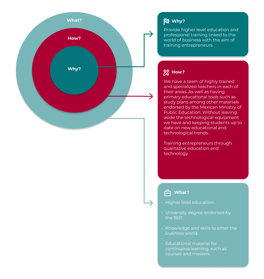
The vision of this University is to create people that can mark a difference by having an education focused on entrepeneurism through special education acording to the world's needs.
Redesigning visual experiences.
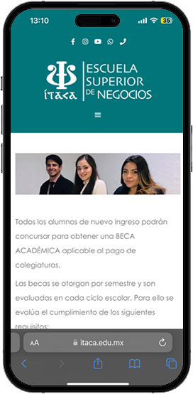
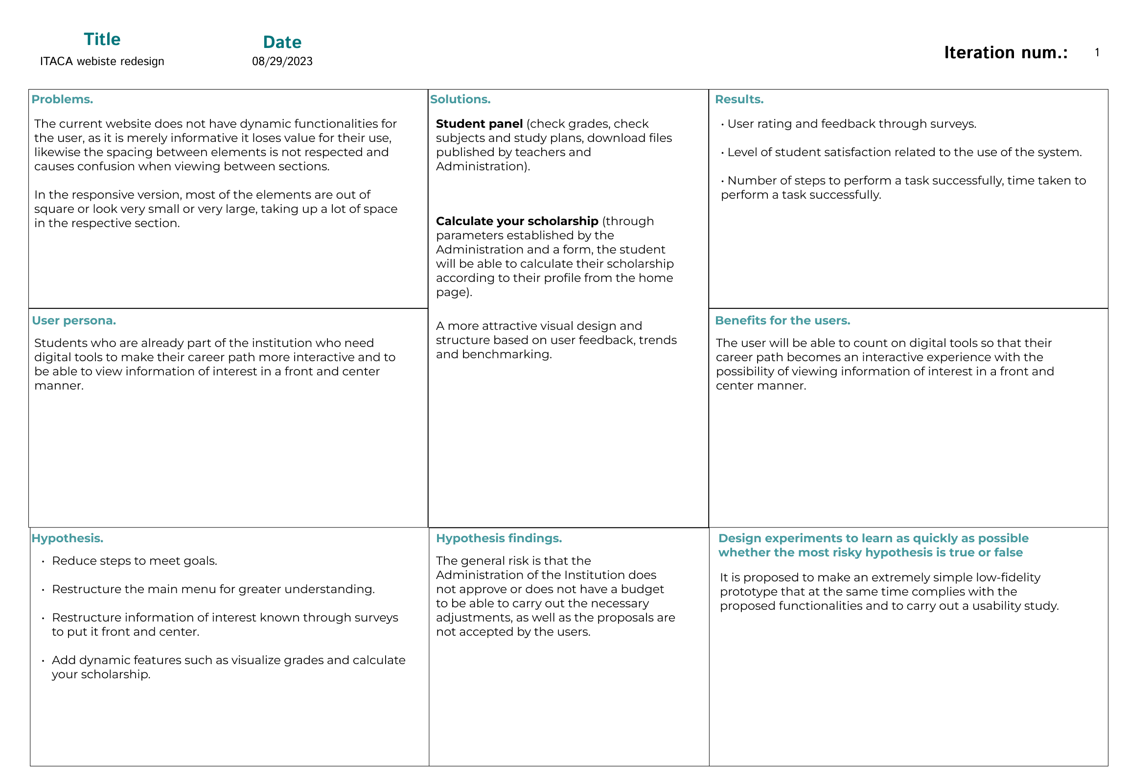
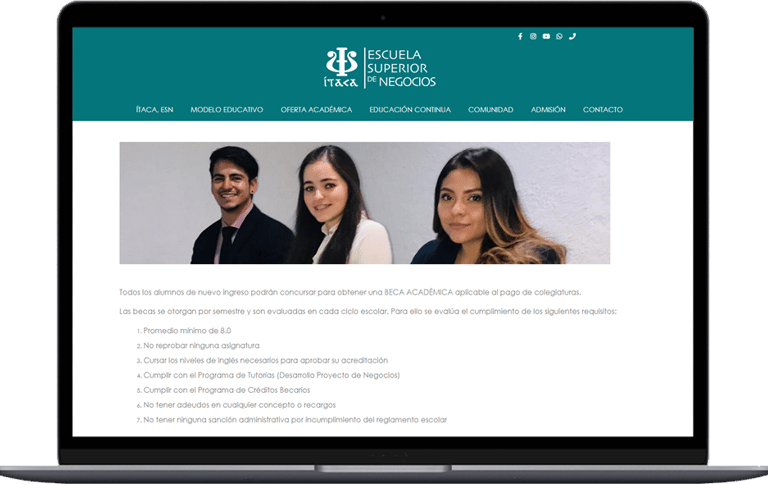
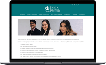
Currently the website does not have any interactive functionality for the user, it is merely informative and the structure can be improved according to the benchmarking carried out and the new trends analyzed, without leaving aside the visual design that is outdated according to the aforementioned.
Get students to interact more with the website by adding interactive features according to their needs and improving the visual interface, information hierarchy and structure to attract the attention not only of already enrolled students but also for potential prospects.
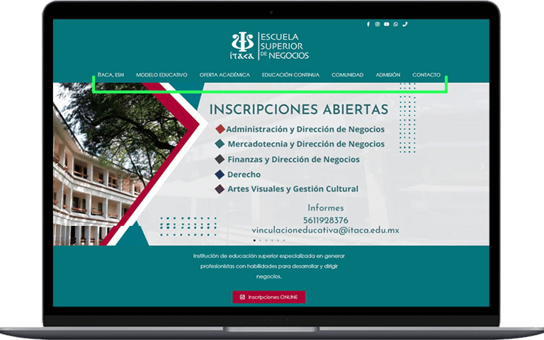
Current website and Heuristics.
Consistency between the system and the real world.
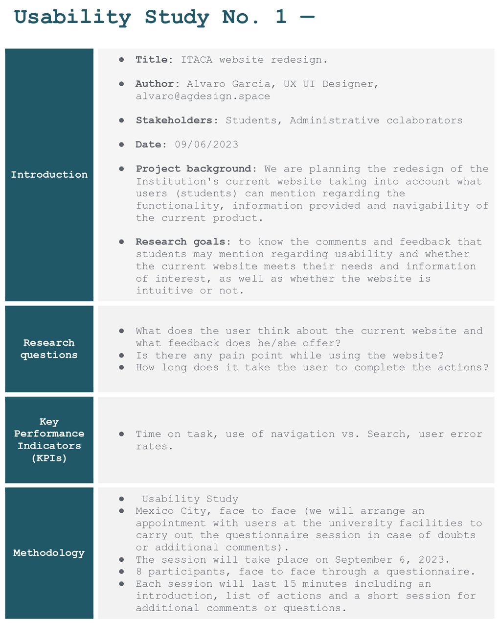
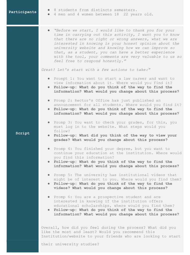
When carrying out the usability study, all users mentioned that the main menu is difficult to understand; they did not find it intuitive to find the information of interest.
Aesthetic dialogues and minimalist design.
Currently there is a lot of text and little visual elements, as well as content that is not of interest to the student, this is based on the usability study and surverys that were carried out regarding the current website. Not to mention that the spacing between elements and/or sections is not respected.
Consistency between the system and the real world.
Using a language when writing that is more familiar or universal for the user, with this we can avoid confusion and improve the browsing experience on the website.
Aesthetic dialogues and minimalist design.
Optimize the texts by analyzing the information that the Educational Institution wants to mention and write it in a short but concise and direct way, as well as the use of iconography to improve the visualization of the website.
Benchmark (project made in Spanish).
We carry out a study of the competition to know how they structure and present their content, dynamism, visuals, brand identity and navigation, as well as to know how they implement the product in a responsive way. Thanks to this study we can know what and how we can improve in our website redesign in all the aforementioned aspects.
It is a starting work tool for the purpose of our project that allows us to analyze a problem, look for solutions and do experiments to test our assumptions.
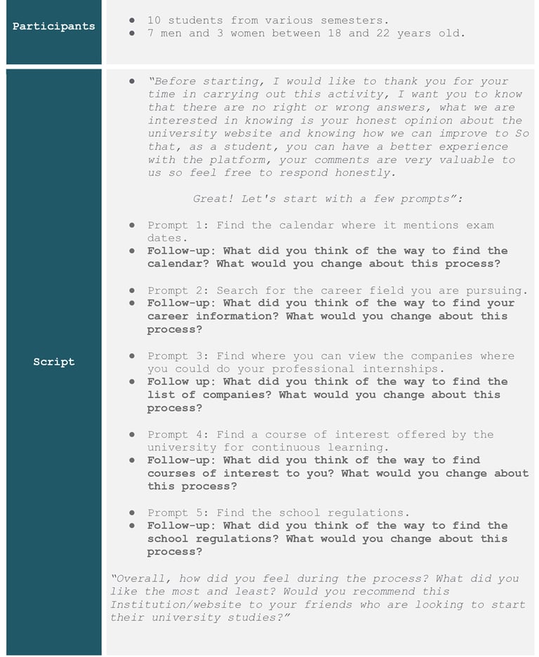
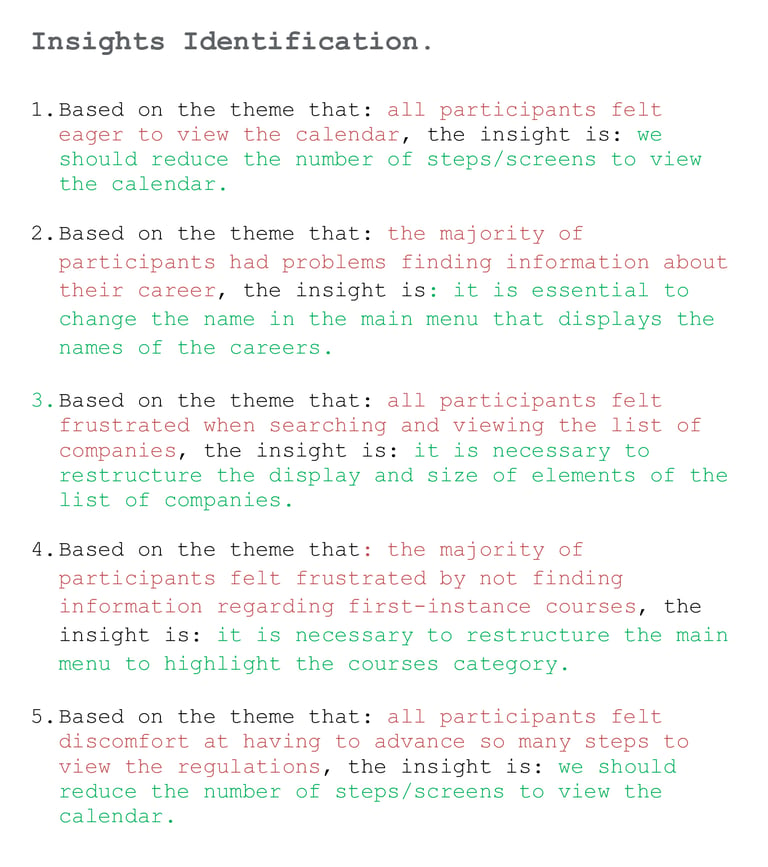
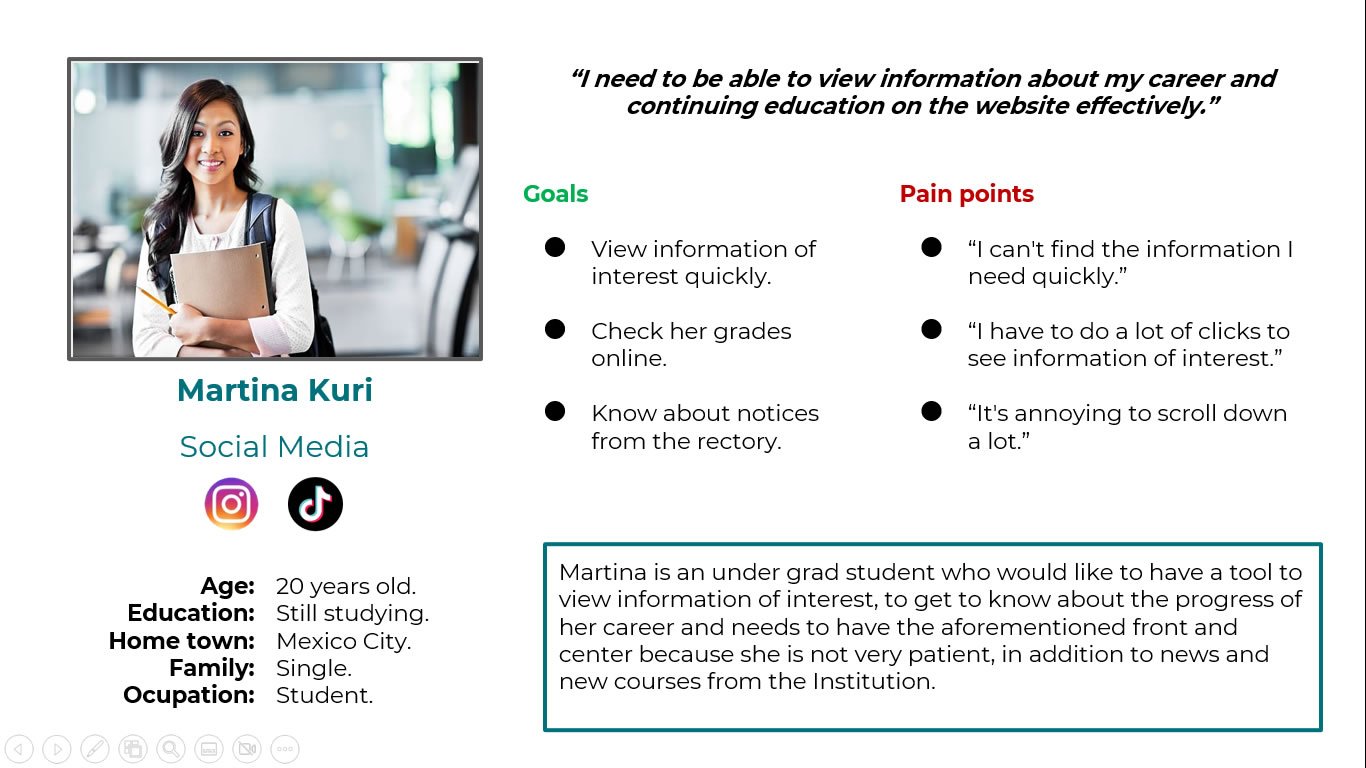
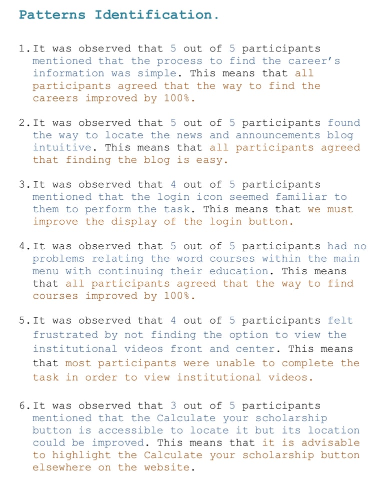
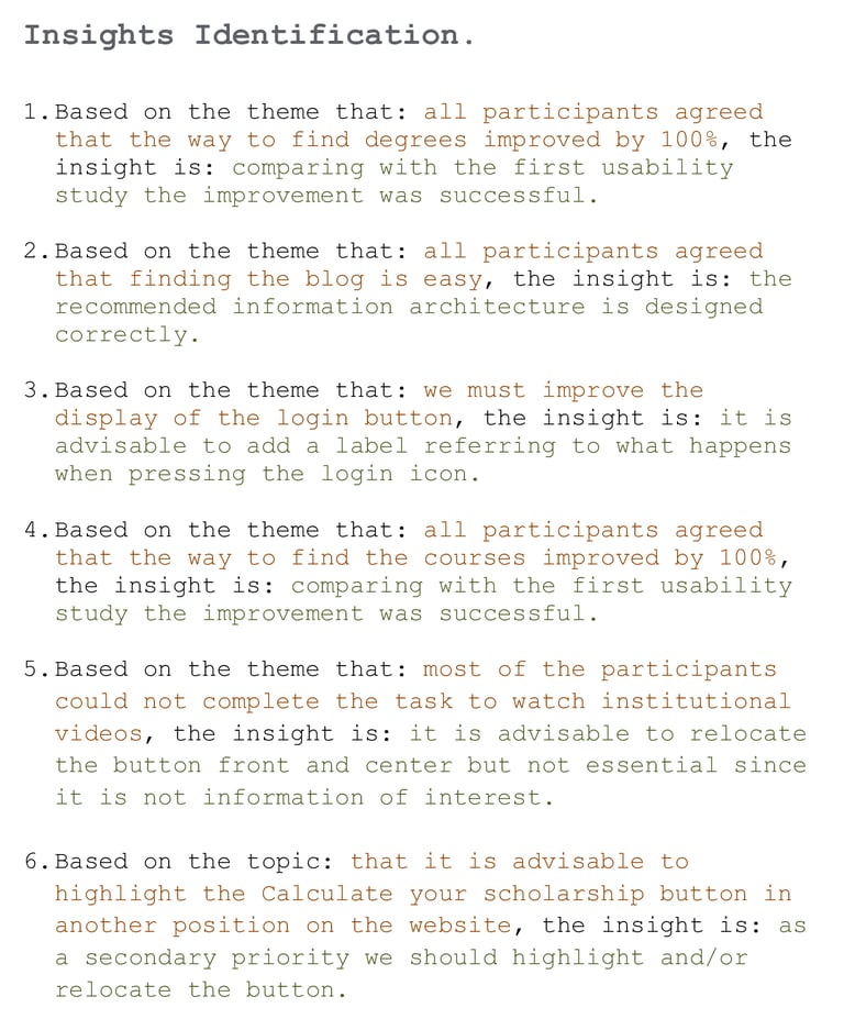
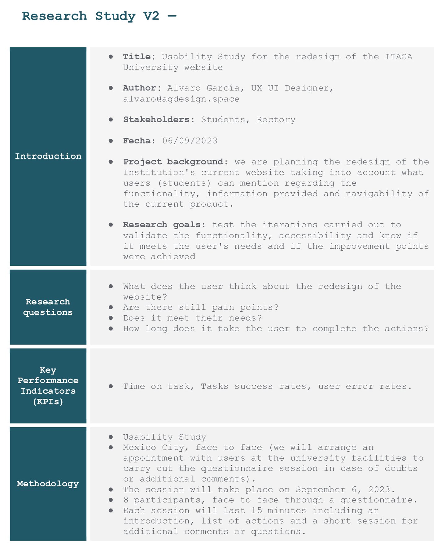
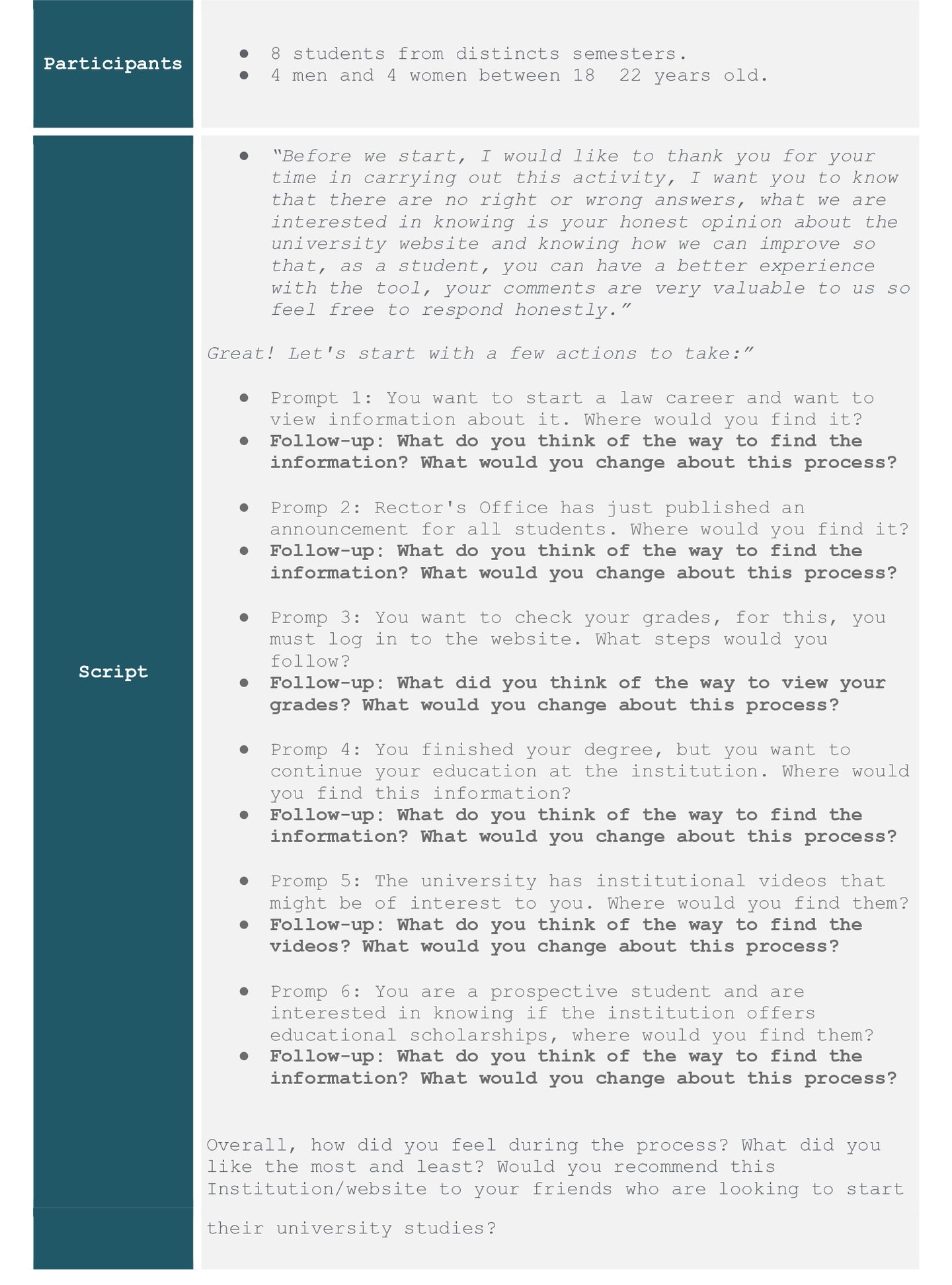
According to the usability study based on the journey map and the form answered by the users of interest, we found the following patterns and insights.
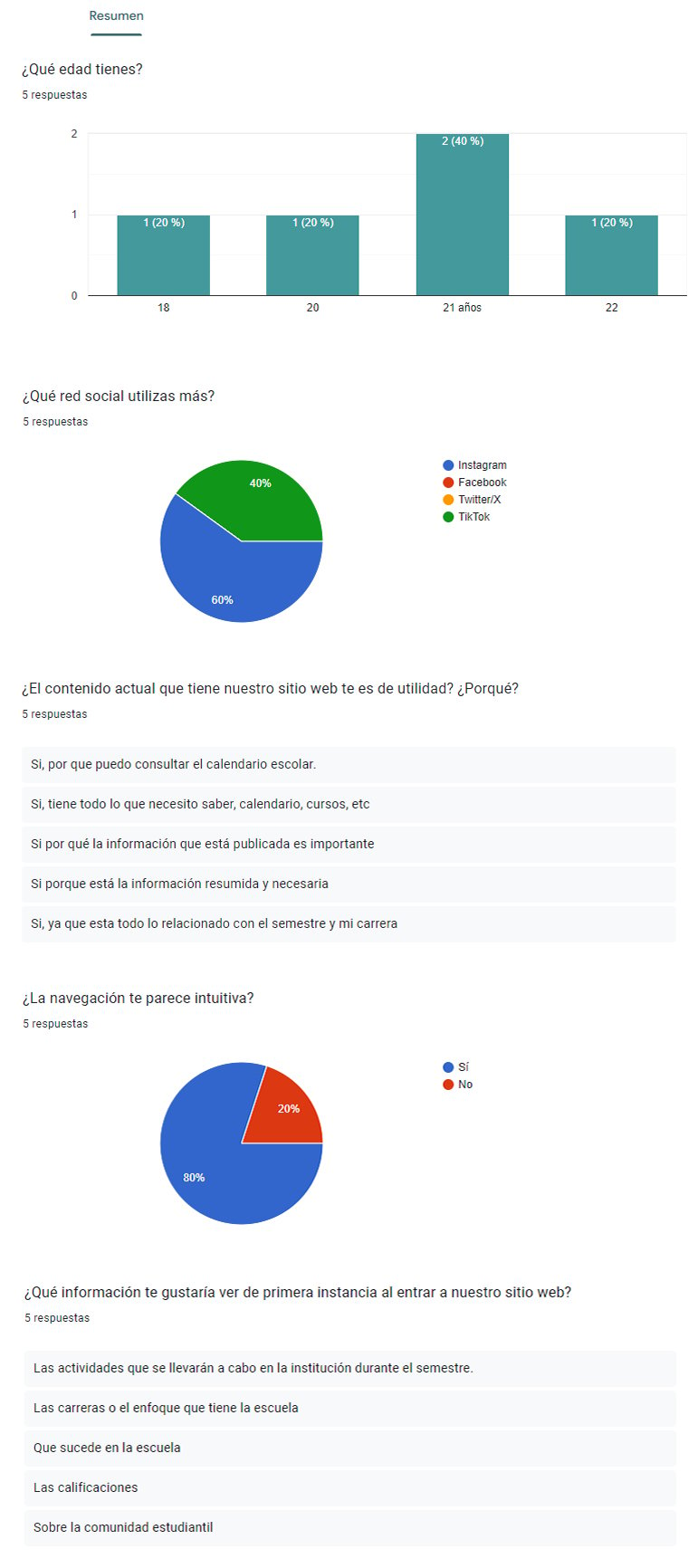
User's Survey (project made in spanish).
As first results, by carrying out the aforementioned research, we managed to generate our User Persona to know our target audience.
Structuring the project and prioritizing the solutions.
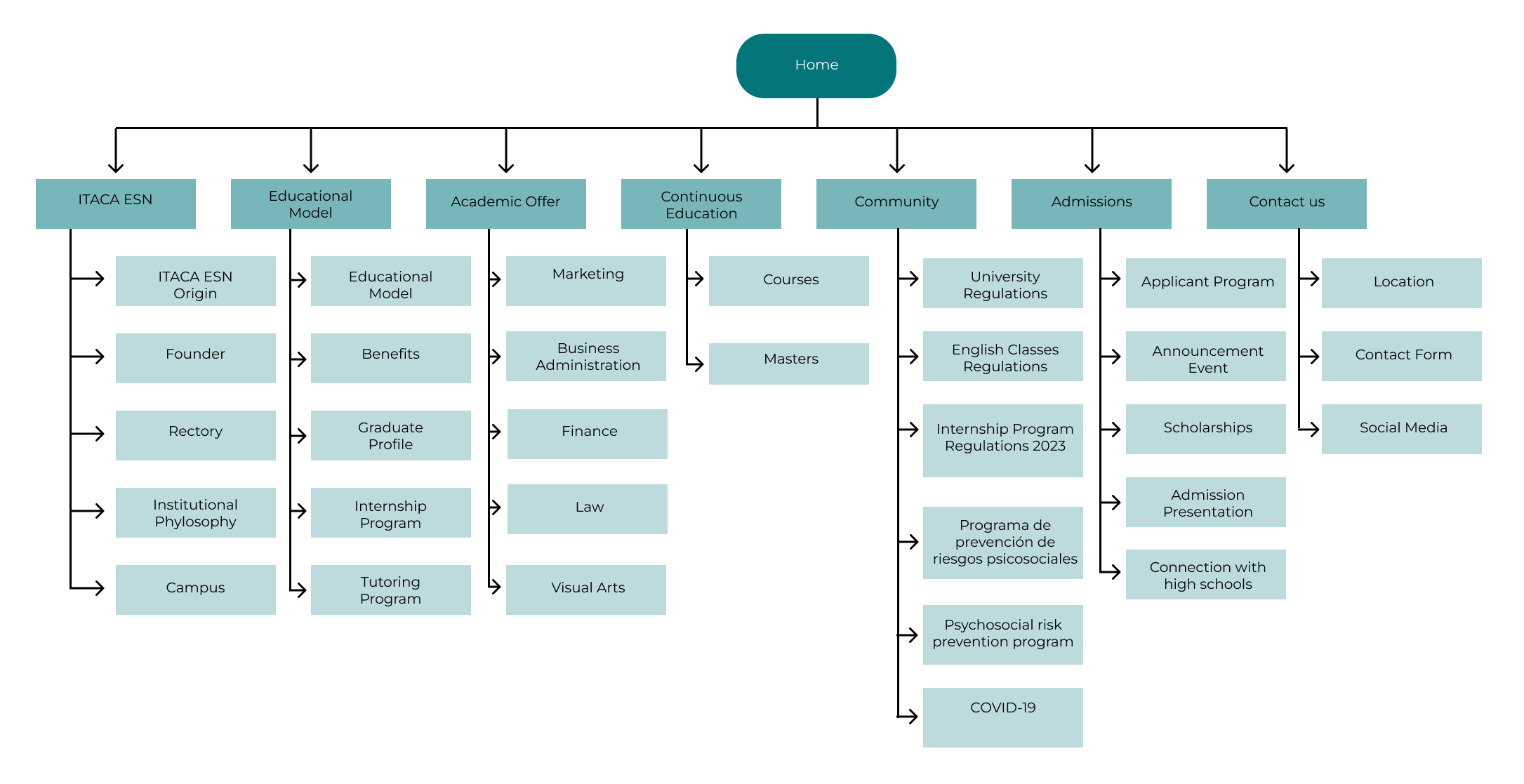
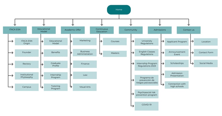
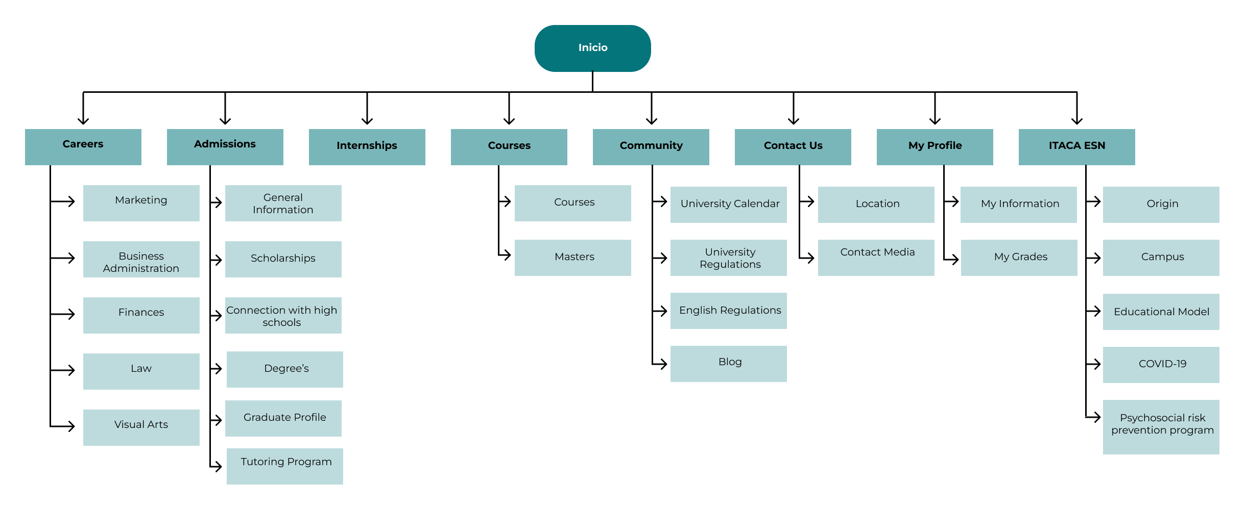
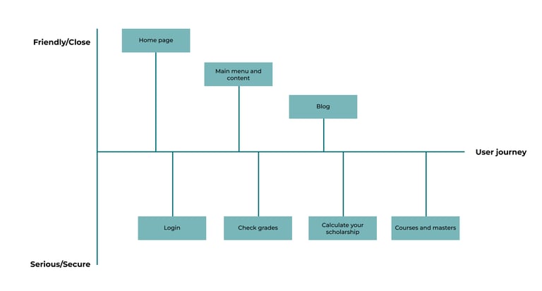
Information Arquitecture.
At this point, we started to get busy with the first skeleton of the project by redesigning the main menu according to the insights obtained from the first usability study.
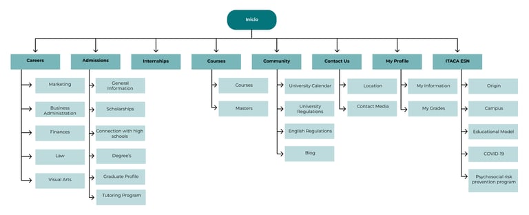
Current Information arquitecture.
Brand new Information arquitecture.
Now we begin to order, prioritize or discard the possible solutions, changes or new functionalities that we will or will not implement in the project, based on the information obtained by users regarding their needs.
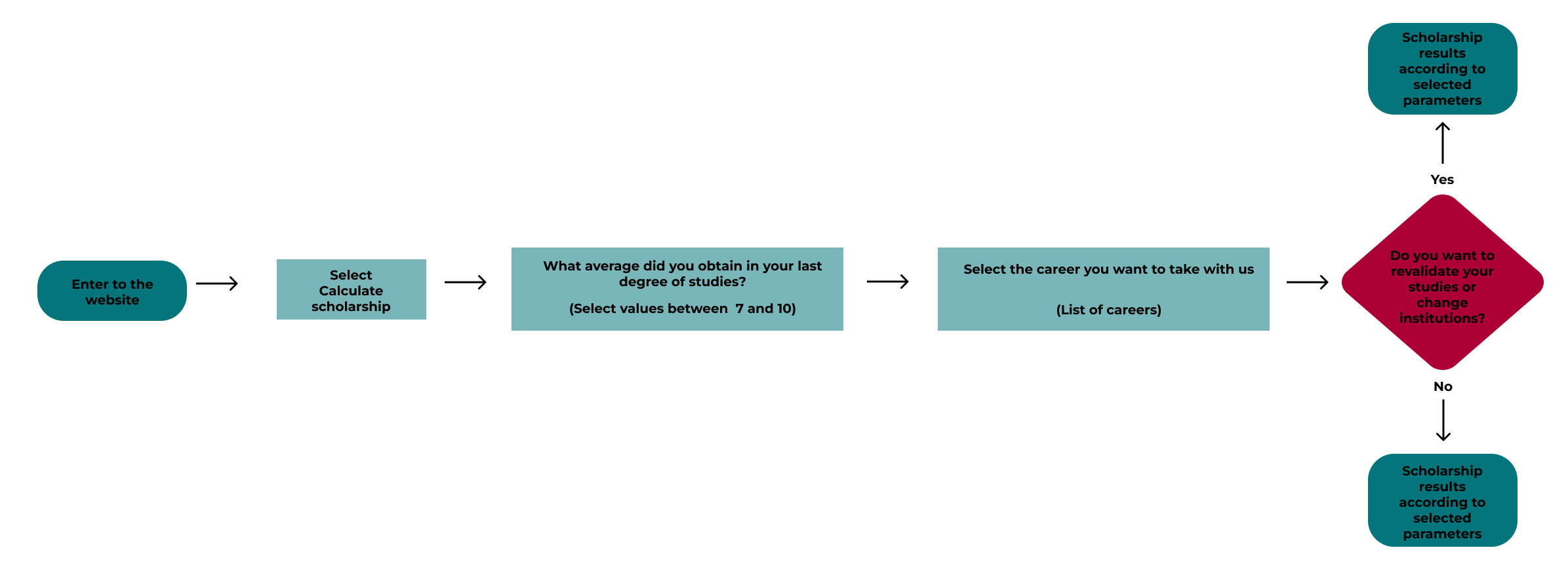
Creating the first taskflows, userflows and wireflows for the new functionalities.
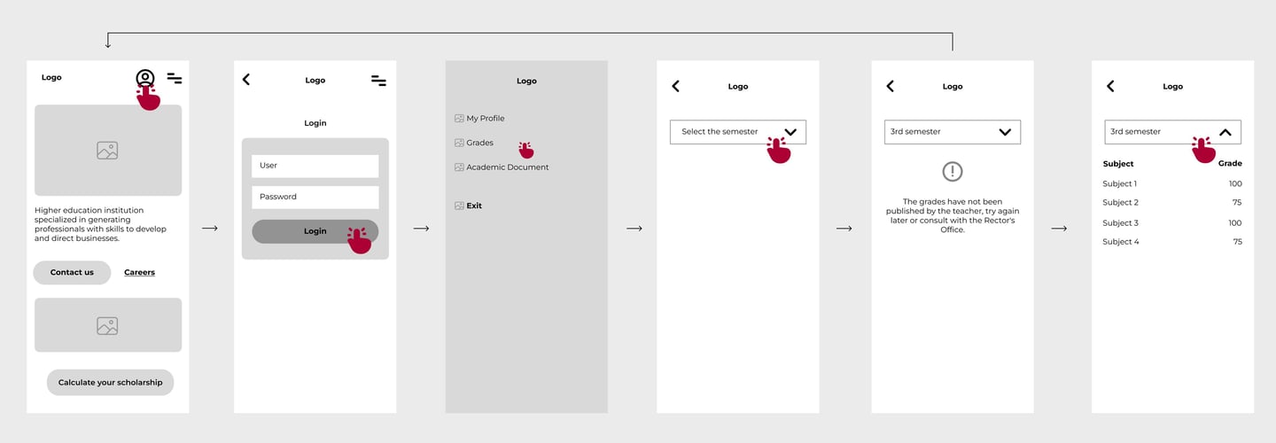
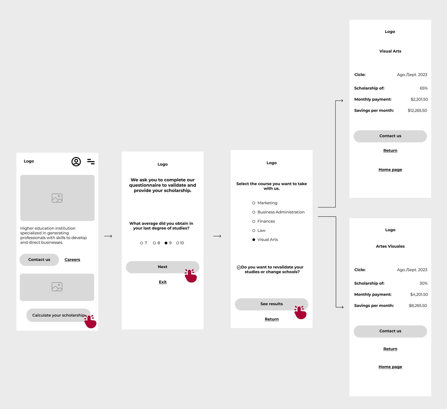
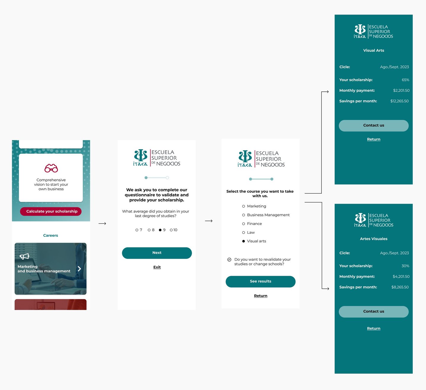
According to the previous research at this point and the new ideas we came up with, we've created the first visual and functional screens, the results above.
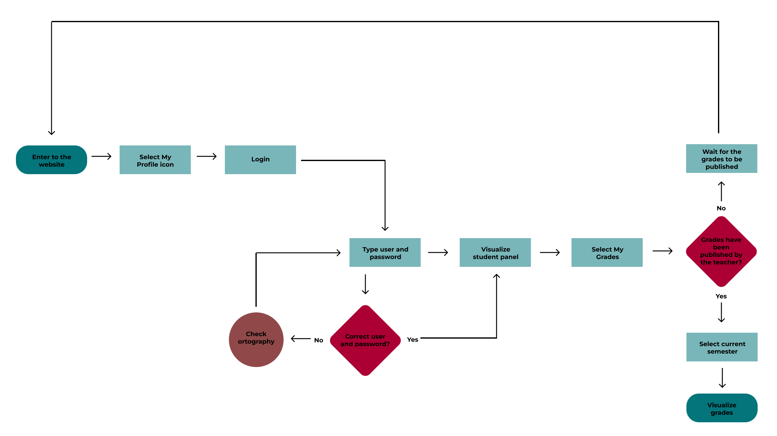
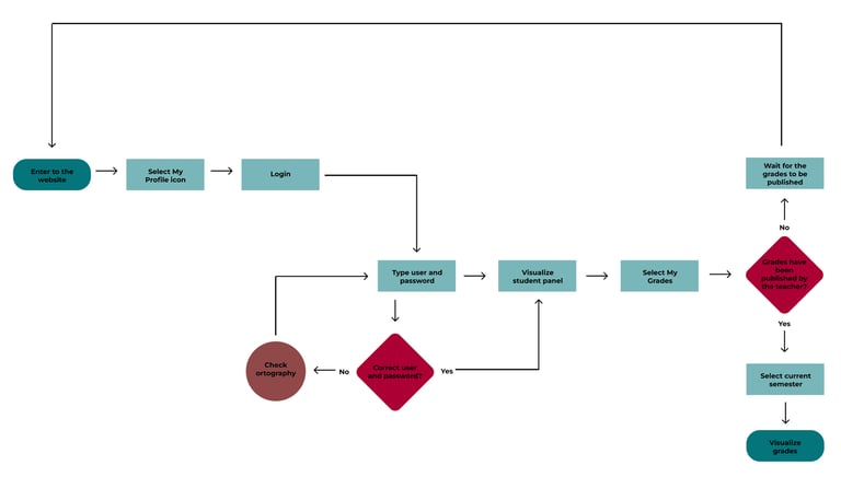
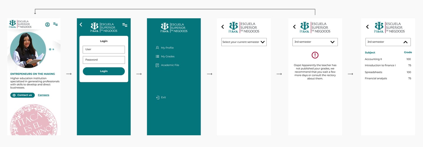
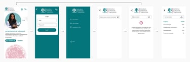
Taskflow for the students to check their grades.
Taskflow for the prospects to calculate their scholarship.
Getting ready for the High Fidelity Prototype and the communication tools for development (Hand-off document).
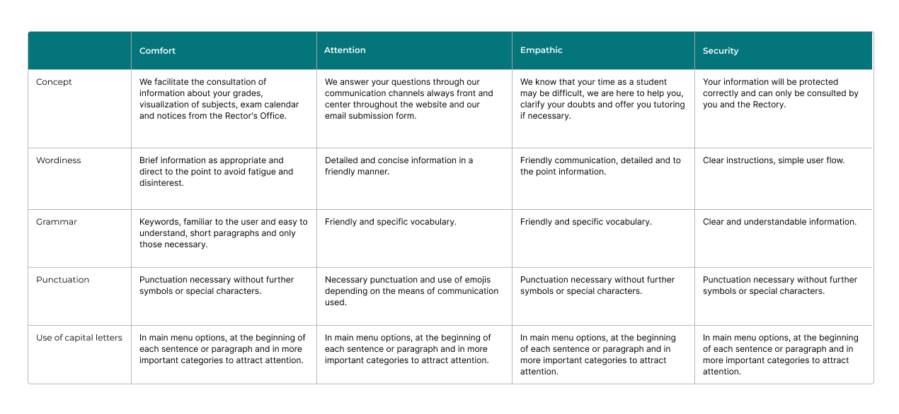
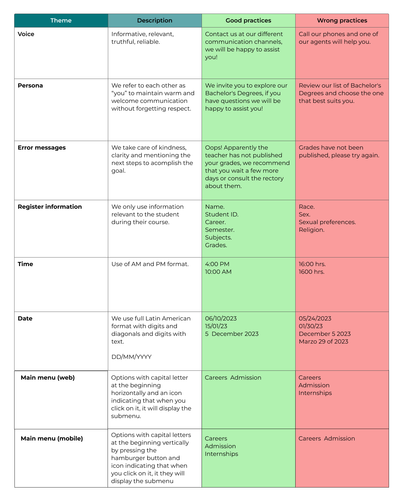
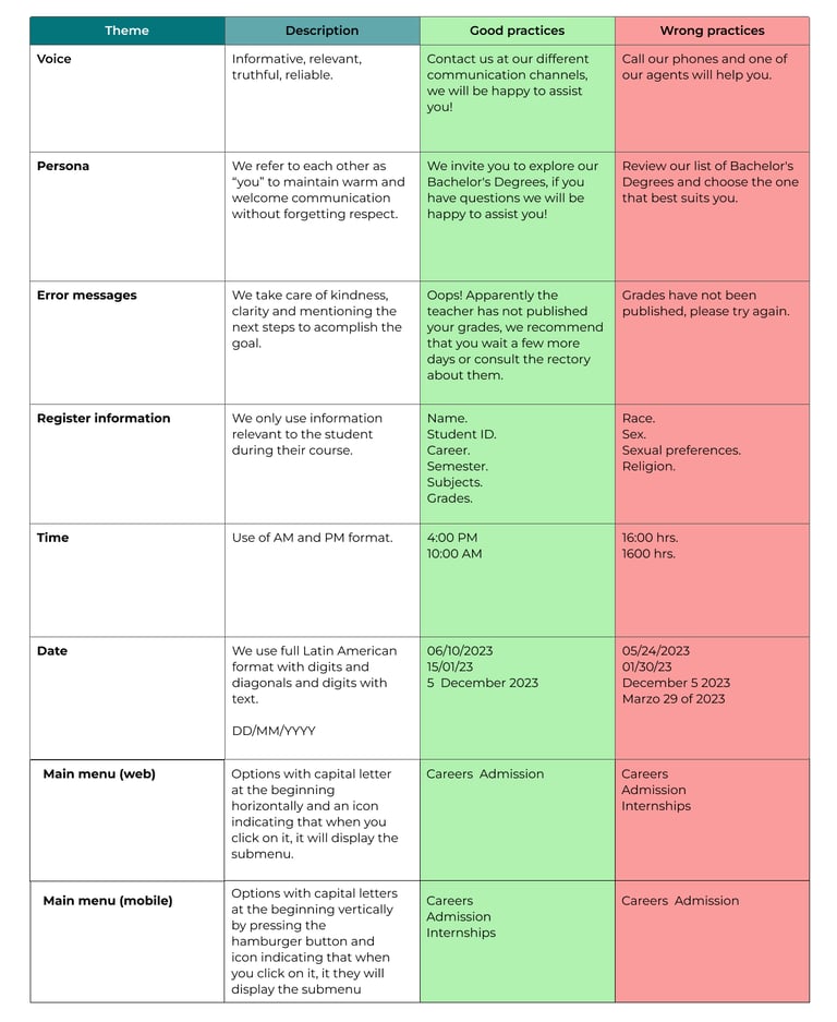
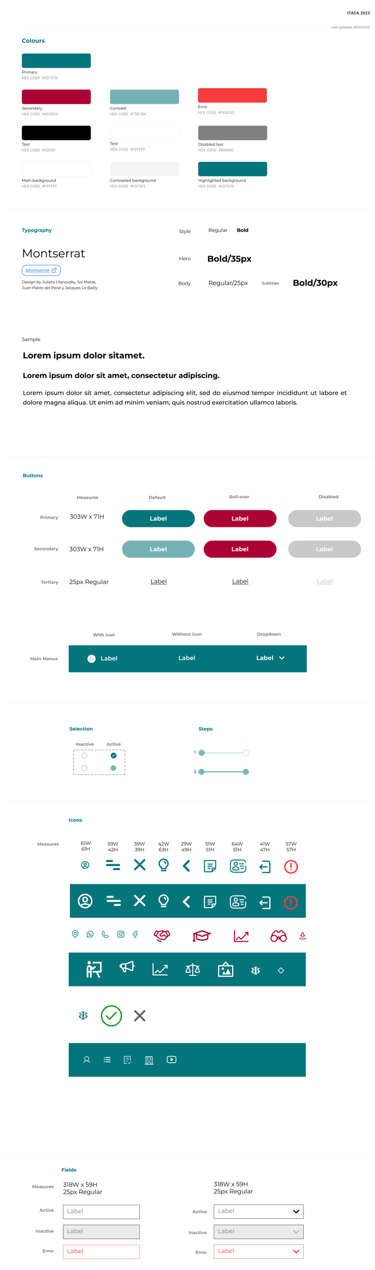
As part of the hand-off, we started to create some of the most important UX Writing tools in order to know the right approach regarding how to communicate with the users. With this, we we're able to create the copies/texts based on this particular research. This includes the styleguide and design system as well.
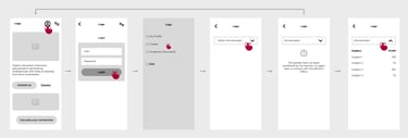
At this point, we focused on making the first High Fidelity wireflows with minor iterations regarding the new functionalities of the website, wich are consulting grades for current students and to calculate the scholarship for new prospects.
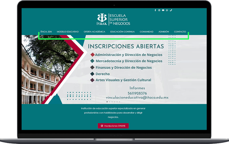
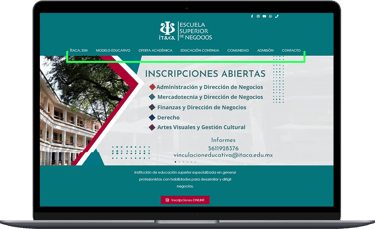
In order to launch the new website we made a second usability study for us to validate the proposed structure, visual appearance and new functionalities. We are proud to say that the results were amazing and there was just a few iterations that we had to make.
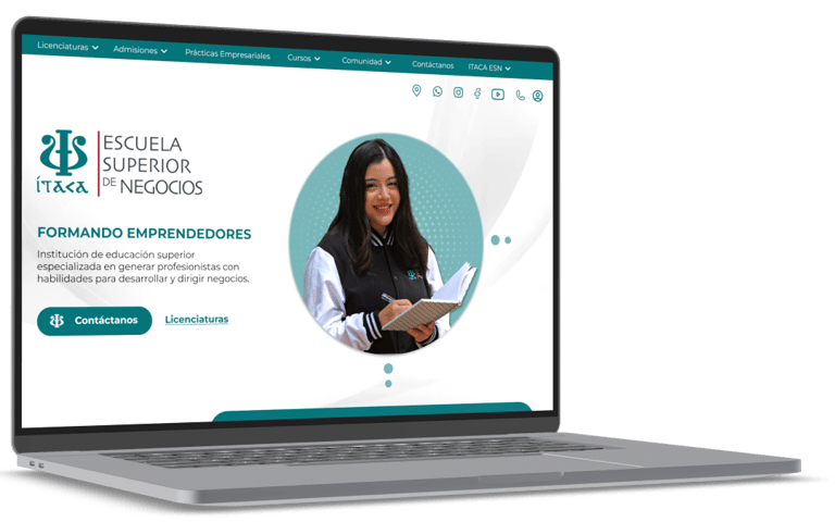
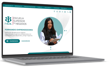
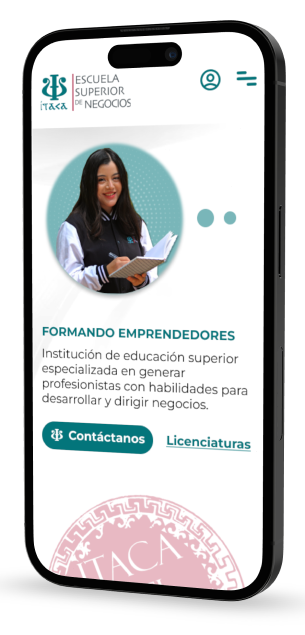
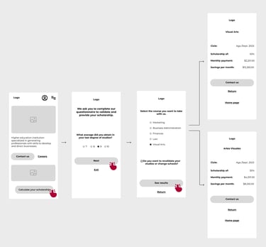
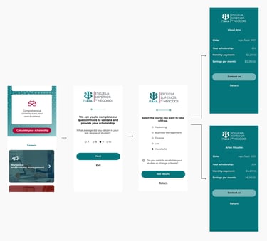
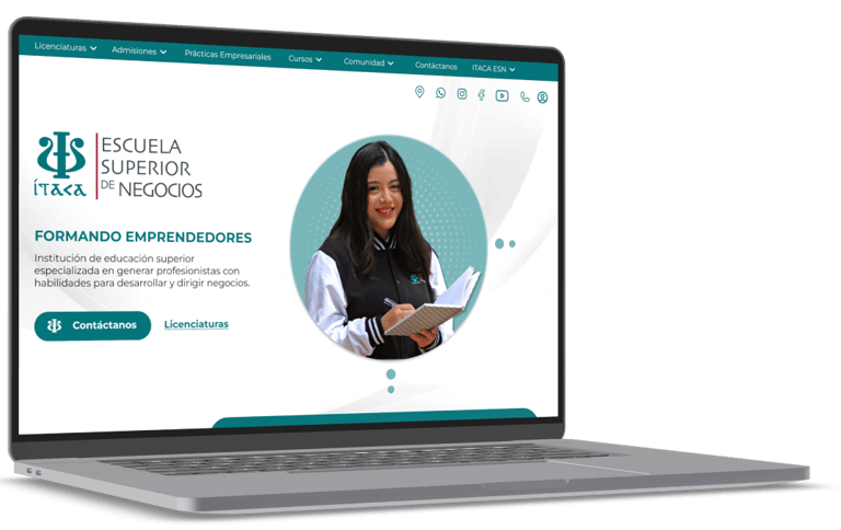
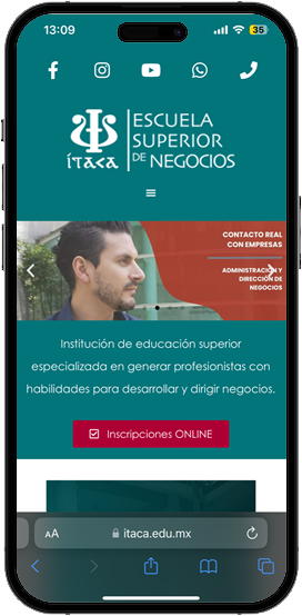
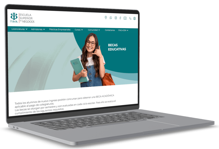
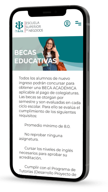
So that's a wrap! Once we made the minor iterations, here's a taste of the results:
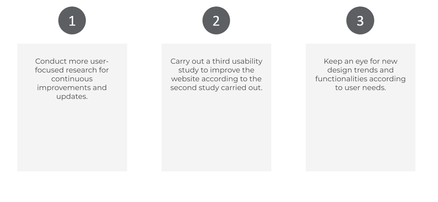
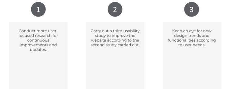
It's not the end, staying updated is an absolute necessity.
What impact do we generate for the Educational Institution?
The redesign we carried out on the website will be extremely helpful both in attracting prospective students by having created a more striking visual and functional experience that meets their needs, as well as for students who already belong to the community by having added new functionalities and content of interest better structured according to the first usability studies that were carried out with them.